The Great Recession ended in June 2009. But like Lazarus of old, the recession seems to be rattling out of the grave. Consider the most recent headline data on the economy.
Latest Readings on a Throttled Economy
The Great Recession ended in June 2009. But like Lazarus of old, the recession seems to be rattling out of the grave. Consider the most recent headline data on the economy. The second reading on first quarter GDP growth came in at 1.9%, down more than a tad from the 2.2% first reported. The level of GDP is now higher than when the recent recession began, which means the economy is expanding, but the pulsebeat is so weak that more often than not, news commentators and government officials speak of recovery, not expansion. They show that they are nervous.
Then there’s the second round of the European debt crisis, with questions as to whether the latest trouble will bring down U.S. growth.
Shortly after getting the weak GDP growth numbers, we received yet another pitiful reading on employment growth. For a second month, the economy produced fewer than 100,000 new jobs, and May’s unemployment rate nudged up from 8.1% to 8.2%, an increase that is probably not statistically meaningful.
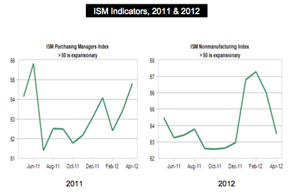
To top it all off, the Institute for Supply Management delivered bad news on the manufacturing economy. Their reading for May dipped below April’s number and, as shown in the accompanying chart, barely remained in the over-50 growth territory. The accompanying figure also contains the ISM chart for June of 2011, which was before the Europe shakedown. Together, the two charts show the 2011 surge, the later slump from the first European crisis, recovery. and now, the current slump. Once again, we should see recovery in the months ahead.
Europe’s Trouble and U.S. Exports
Europe’s economic problems have already given a light haircut to U.S. GDP growth. We see this in the diminishing data for 1Q2012. But while the cut will get closer as Europe’s problems deepen, it is unlikely that U.S. GDP growth will be completely pared away. Back of envelope calculations suggest the following: In 2011, U.S. exports accounted for almost 14% of U.S. GDP. Europe’s share of exports is roughly 20%. Multiplication tells us that if Europe’s share fell to zero, U.S. GDP growth would fall by 2.8 percentage points, enough to throw us into deep negative territory. But exports will not fall to zero. A decline of 10% would be extreme. With that, U.S. GDP growth would fall by only 0.28 percentage points, all else equal. Instead of having growth of 2.25% for the year, we would come in with almost 2.0%.
But all else will not be equal. A weak Europe translates into slower growth with trading partners worldwide. Even so, I don’t think Europe’s travails will wipe out U.S. GDP growth. The loss of European sales will have uneven effects across U.S. industries and states. Chemicals account for Europe’s number one U.S. purchase, followed by transportation equipment, computers, and machinery. Those industry groups will get a heavier hit than others.
There are also financial linkages that will strain U.S. banks exposed to the debt of troubled European countries, and there are foreign exchange effects—flight to the dollar—that will make U.S. goods more expensive to holders of weaker currency. Still, we are considering 20% of U.S. exports. What about the other 80%?
The Developing World is still Pumping Iron
In the March Economic Situation report, I put the spotlight on the astonishing growth taking place in the developing world, with Brazil, Russia, India, and China major players in the pack. Even with Europe’s woes, the developing world is still leading the charge. The latest IMF estimates of world GDP growth have been revised downward from—get this—4.0% in 2011 to 3.5% in 2012 and recovery to 4.1% in 2013. Recall that world growth averaging just 2.5%.will produce a massive amount of goods, services, and improvements in human life worldwide. And remember U.S. GDP growth will come in at 2.5%, if we are lucky. Europe? Look for zero.
The developing world is the new engine. Are we connected?
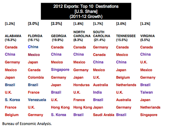
Consider export data for a sample of Southeastern states shown in the next chart. As indicated, year-over-year export growth has been exceedingly large for some of the states. This value is shown in parentheses under the state name. The state share of U.S. total exports is shown in brackets at the top of the chart. Notice the top destinations for exports from the states and the frequency of China and other developing countries. U.S. expansion depends partly on growing trade with the developing world. But there is still a lot weighing down the U.S. economy.
America’s Crippling Regulatory Habits
There is more to the U.S. problem than Europe or even the past recession. There is a bias toward redistribution woven deeply into the economy’s fabric, a bias that works against productivty gains, innovation, and wealth creation. And it did not begin with Mr. Obama or with Mr. Bush, though their administrations strengthened the bias mightily. The redistribution disease seems to have begun in the very early 1970s, perhaps in 1970 when Richard Nixon severed the dollar from gold.. It was then 3 that the U.S. went on an amazing deficit binge. This was accompanied by a regulatory rush that gradually yet systematically introduced endless rules and constraints on how we work, what we produce, where we can produce, how we market things, and how we hire, just to name a few of the major rule categories. Funded with deficit dollars, the regulatory establishment was able to grow more rapidly than federal revenues.
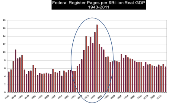
From 1970 to the present, 2.5 million pages of new and modified rules have been published.
New pages in the Federal Register form a proxy for regulation growth. And the number of annual new pages divided by real GDP is a proxy for the overall economic burden of those rules. The next chart shows the ratio and the mountain of rules that emerged in the 1970s. Can an economy, even a strong market economy, digest this much government regulation without choking or at least sputtering?
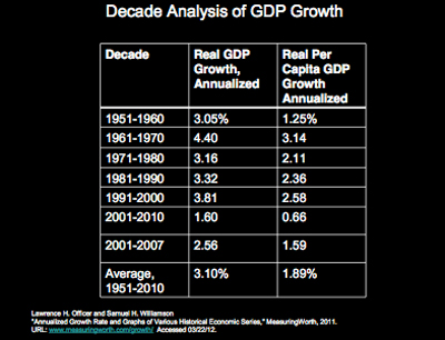
I next offer a chart that shows in the third column GDP per capita annualized growth for decades beginning with the 1950s. Notice the high level of growth in the decade of the 1960s, then a sharp decline in the1970s followed by less than 3.0% growth in the 1980s, and 1990s. Finally notice the almost disappearance of growth in the last decade. Even though regulation contributed to the financial collapse and Great Recession that followed, I show growth for the years 2001-2007 to avoid the low-growth recession years. Even here, we see 1.59% growth.
We have a muffled economy. Regulation is a heavy part of it, but, of course, there is more going on. Getting untangled is indeed the challenge. Meanwhile, we hope that better than 1.9% real GDP will continue.
What’s Hot and Cold
At times, it is easy to get the idea that the U.S. economy is falling apart at the seams. Not so. Just part of it is! Private sector employment is clawing forward and much of the progress gained is in manufacturing. The charts here show value of shipments data and with the exception of one industry—wood products—show remarkable post-recession recoveries and expansions. For example take a look at the first chart, primary metals. When viewing these, it’s a good idea to spot the level of shipments just as the recession began and then see if the latest level of shiipments is above that earlier value.
How about the States?
It has been a long walk from June 2009 when the recession ended, and believe it or not, a lot of progress has been made. This is seen in this chart that shows state unemployment maps for April 2012 and, in the upper corner, March 2009. Dark colors denote high unemployment. The map for 2009 shows lots of misery. Things have brightened considerably across the nation. Only California and Nevada are colored with darker hues.
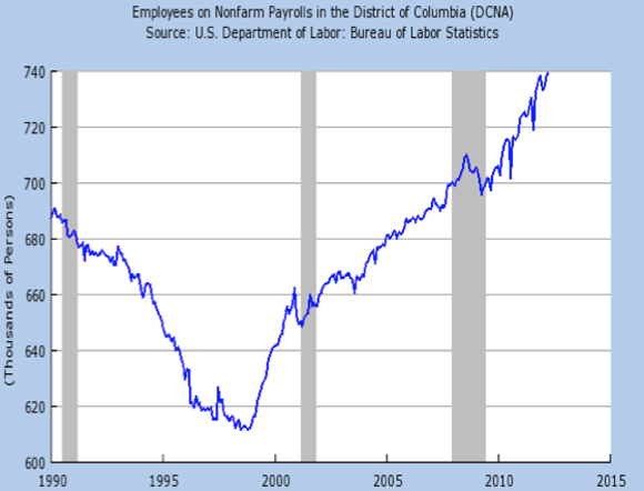
Those looking for work might want to focus on states where unemployment rates are lowest, the lighter colored states in the chart, the Dakotas, Iowa, and Wyoming., for example. And the hotest location of all for employment growth? Not a state but the District of Columbia. D.C. has the highest per capita income in the nation, by a long shot, and suffered hardly any recession at all. Take a look at the total employment graph for D.C. that follows. Employment exploded in the nation’s capitol. Amazing..., and somewhat disturbing, to say the least. Is D.C. creating new wealth or redistributing wealth? Something to ponder.
Hope and the Ordeal of Change
In his 1952 book, The Ordeal of Change, Eric Hoffer, America’s longshoreman philosopher, reflects on a time when he lived among tramps, jail birds, and other lost souls during the Great Depression. Hoffer discovers a great respect for these people, for he recalls it was just their kind that settled and built much of this country. With not lot to lose, many like them took on risk, moved when they had to, worked hard, and built a better life for themselves. They helped create wealth.
Speaking of those early builders, Hoffer puts it this way:
“Certainly they did not go out deliberately in search of hard work and suffering. If in the end they shouldered enormous tasks, endured unspeakable hardships, and accomplished the impossible, it was because they had to... It was a question of do or die. And once they tasted the joy of achievement, they craved for more.”
Have We Lost the Joy of Achievement?
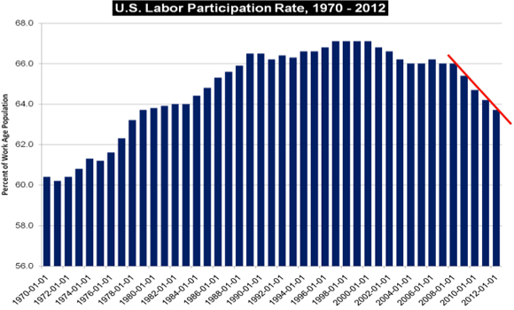
Buried in recent Bureau of Labor Statistics reports on employment are some troublesome data on the the nation’s labor participation rate. This is the share of the work-age population that is estimated to be in the labor force, either employed or looking for work. In the accompanying chart, I show January values for the years 1970 through 2012. A red line heading south is seen on data for the years 2008 to 2012. At present, the participation rate is roughly where it was in 1978. Lots of gains in employment access seem to have been crushed by the slow economy. And apparently lots of discouraged workers are no longer looking for work, and lots of young people are staying in school. As widely reported in the media, large losses in the number of people seeking work explains the falling unemployment rate.
But there is something else going on. When people decide to open a business and work for themselves, they may not show up in the employment data. Think about it this way: if eveyone now working for someone else decided to start a one-person firm and contract with their current employer, there would be an explosion in small businesses and a disappearing labor force. Form 1099s would replace 1040s. Unemployment rates wouldn’t be worth a toot.
What about New Business Starts?
The Kauffman Foundation’s most recent entrepreneurship index report tells us that the share of U.S. adults who started their own businesses rose sharply during the recession and is still growing at a faster clip than before the recession started. The index is based on a sample of about a half million adults. In 2011, according to Kauffman estimates, there were 543,000 new businesses started each month! That accounts for roughly six million people. In short, when the going got tough, lots of people apparently decided to quit looking tor work. They hired themselves.
The estimated number of starts is high, yet we have to remember the number of business death that occur routinely. Also, the Kauffman index arrives at a much higher count of new businesses than does the Bureau of Labor Statistics ‘(BLS’) estimate of new business establishments. But the BLS number is for businesses with employees. Nonemployer firms, those with just one employee, the owner, do not show up in the BLS count. There were more than 21 million of those in the U.S. in 2009. Nonemployer firms and those with payrolls show up in the Kauffman count.
Arizona, where the unemployment rate has been high, was the leading state for new businesses. West Virginia, with a strong coal economy and low unemployment rate, ranked 50th in the Kauffman index. Latinos were the leading demographic group starting businesses. In terms of educational attainment, those with less than a high school education were the leaders. And in terms of trade or professional activities, construction was the number one category.
The data tell us that some of the hardest hit in the workforce, those in construction with low levels of education, became the leading entrepreneurs. And more businesses emerged in states where job prospects were bleak. Entrepreneurship was highest in the West, where unemployment rates are the highest, next highest in the South, third highest in the Midwest, and lowest in the Northeast.
Do the data tell us that eveyone lived happily ever after? No. Do the data say that most of the businesses prospered? No. The Kauffman report tells us that when hard times arrive and people are thrown out of work, a lot of them strike out on their own. They become a part of the falling participation rate.
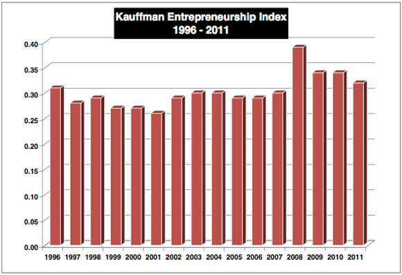
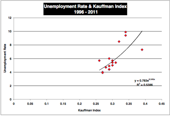
I show the data for 1996 through 2011 in the next chart. Right after it, I show how the national unemployment rate maps into the entrepreneurship index. The data there are rather compelling. In short, a lot of those people who no longer participate in the labor force are working for themselves.
Final Thoughts
The discussion of work and new businesses brings to mind a common topic of concern that I hear when meeting with business people in my work. During the last year, the main concern that I heard was this: “We cannot find qualified entry level workers who want to work.” I heard this from small manufacturing concerns, from services, and from people in industrial distribution. A seemingly paradoxical situation, given the high unemployment all about us.
When pressed to explain what they mean, a common response from manufacturers and wholesalers goes like this: “We can find people who have good reading and math skills, who are drug free, and have a clean criminal record. But we can’t find such people who want to work, who will get to work on time, and stay on the job. There are just too few people who are willing to sweat.”
Business groups around the country are actually offering seminars in their regions on what it means to hold down a job. Others are offering their current employees bounties if they bring in a job applicant who makes the grade, is hired and performs. They do these things for good reasons: These firms cannot expand or replace retiring personnel for lack of qualified workers.
Can we expect something better?
There’s a lot going on here, but I believe that incentives matter for most of us. When unemployment benefits come to an end, as tough as that may seem, many who understandably relied on the benefits will do what Hoffer suggested. They will get to work. Hoffer observed that work brought a transformation. People working and holding down responsible jobs even looked different. As he described it, their eyes brightened. They were like new people who suddenly learned the joy of achievement. Their incomes rose as did their self esteem.
Will it happen again? I believe it will, but the ordeal of change will make the transition difficult.

