- | Government Spending Government Spending
- | Policy Briefs Policy Briefs
- |
The Economic Situation, June 2013
The US economy is creating new wealth and growing employment, albeit at a slow pace. But uncertainty is the key word that describes the economic situation at mid-2013. There are major unknowns with respect to Fed policy, taxing and spending, the effects of Obamacare on employment, the implementation of Dodd-Frank financial reform, regulatory policy affecting the production of electricity, and the prospects for Europe’s recovery from an extended recession. Add to this pallid picture reductions in growth in China, India, and the developing world taking some of the edge off the global boom, which, in spite of that growth haircut, is still tugging away on America’s export growth.
The US economy is creating new wealth and growing employment, albeit at a slow pace. But uncertainty is the key word that describes the economic situation at mid-2013. There are major unknowns with respect to Fed policy, taxing and spending, the effects of the Affordable Care Act on employment, the implementation of Dodd-Frank financial reform, regulatory policy affecting the production of electricity, and the prospects for Europe’s recovery from an extended recession. Add to this pallid picture reductions in growth in China, India, and the developing world taking some of the edge off the global boom, which, in spite of that growth haircut, is still tugging away on America’s export growth.
With the closing of the books on the 2012 economy, real GDP growth registered 2.2 percent. But the current picture suggests we will be lucky to break 2.0 percent in 2013 and a bit more in 2014. This compares with the results of the Federal Reserve Bank of Philadelphia’s Livingston Survey in December 2012, which predicted 2.1 percent growth in 2013’s first half and 2.3 percent in the second half of the year. It will be a while before Livingston speak again, but right now, Economy.com’s dynamic GDP growth meter indicates the economy is expanding at 1.8 percent.
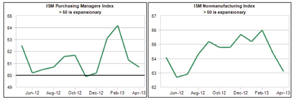
As Goldilocks might put it, “It’s not just right.” Not by a long shot. We can see images of the slowdown in the Institute of Supply Management’s indexes for the manufacturing and nonmanufacturing (service) economies shown below. Both indexes are headed south of the border. Recall that 50 is the magic number that coincides with zero growth.
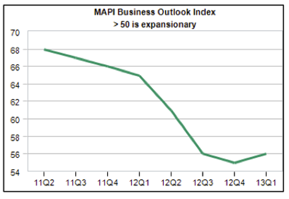
But there is a bit of hope seen in the MAPI business outlook index. As seen here, it took a swoon in late 2012 but is now pointed north, barely. This reflects the expected output effects associated with new capital investments and related production improvements. Again, 50 is the neutral point for the MAPI index. Right now, the index rests in positive territory.
So we are on a bumpy slow-growth highway, but there is growth. As a result, several major economic sectors have fully recovered from the Great Recession demise. These include manufacturing, retail sales, machinery wholesalers, and Federal revenues.
Housing in Recovery
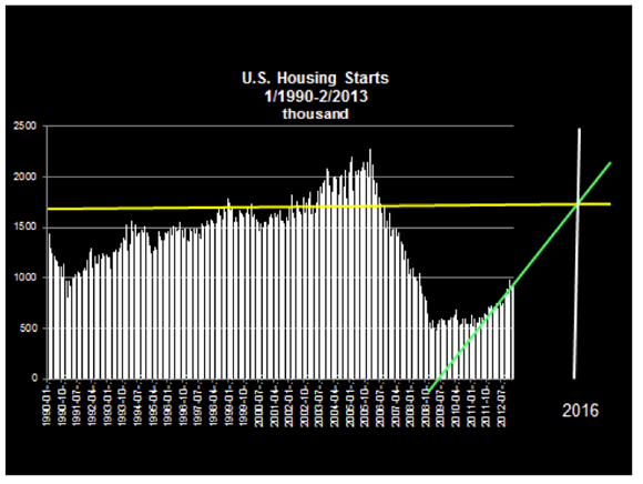
Housing is the key sector still in recovery, but out of intensive care. I show national housing start data in the next chart. The yellow horizontal line marks 1.6 million annual starts, the longer-term norm. As shown, if the current trend continues apace, and I believe it will, housing will recover to the norm by around 2016.
Pick-ups Are Picking up
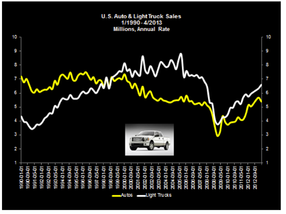
We see an indirect confirmation of housing’s recovery in another way. I’m always looking for real indicators of progress; in my early morning travels, I love to pull into one of those mega filling stations where lots of vehicles, especially pick-up trucks, are filling up for the day. Powered by the housing recovery, these are real people doing real work for other real people: carpenters, painters, drywall installers, heating and air conditioning folk. But here’s the good news: the number of trucks seen on-site is growing. And the trucks are getting newer.
Inspired by this, I created a pick-up truck economic indicator. Here you see a time series for autos mapped with a series for light trucks. Look at the most recent observations: pick-ups are outpacing autos. Yes, there is lot going on behind these numbers, but there’s also a lot going on in the numbers themselves.
America is building again. Things are getting better.
What’s Happening in Manufacturing?
US manufacturing was the locomotive that pulled the country out of the Great Recession. And within manufacturing, auto production was the lead engine. With the recession still visible in the rearview mirror, what can we say has happened? Is manufacturing still hot? Is there enough “reshoring” of production from abroad to see a return in data?
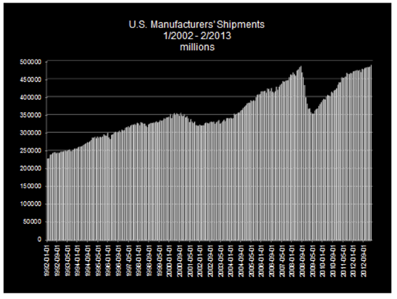
Consider some data. The next chart shows the nominal value of all manufacturers’ shipments for 1990 through February 2013. Here we see a fully recovered sector. The current level of shipments just barely exceeds the 2008 peak. And while the growth pace has slowed since 2011, the slope of the earlier part of the 2009–2012 recovery is steeper than its 2004–2007 counterpart. Put another way, manufacturing was really hot in 2010–11 but cooled more than a bit with Europe’s slowdown in 2012.
Looking inside the Box
When I open the manufacturing box and examine the contents, we can begin to identify which sectors seemed to have the most wind in their sails. I do this in the next chart, which reports growth in value added for some sectors from 2004 through 2011.
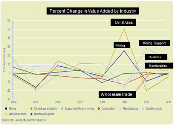
The boom in oil, gas, and related industries is clearly seen here. We also see a mini-boom in durable-goods production. Wholesale trade growth follows the manufacturing pattern.
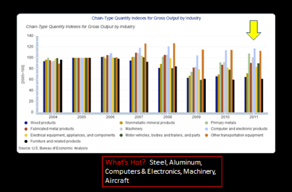
I take a deeper cut by looking inside the durable goods category. The next chart reports a series of indexes where 2005 is equal to 100. With this in mind, the 2011 data suggest that if reshoring is occurring in a meaningful way, we should expect to find it in steel, computers and electronics, machinery, and aircraft. These are the leading growth categories.
What about Employment?
Economic recovery is important, but most people want to know about jobs. If manufacturing has recovered, they say, why don’t we see more cars in the parking lots? Generally speaking, when the economy slows down, it is only natural that people in every organization and industry look for ways to become more effective and more productive in their work. After all, the name of the game is keeping employed. Within manufacturing, becoming more productive means shuttering obsolete plants, contracting out activities to lower-cost providers, discovering new supply sources, and investing in new automation tools. Taking these actions can lead to a slimmer workforce, higher output, and lower costs.
The next chart on manufacturing employment tells the tale.
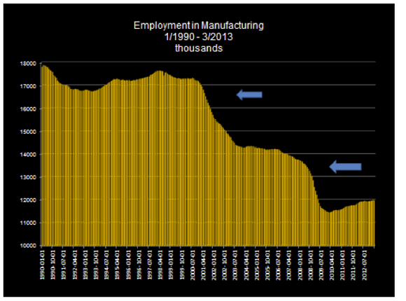
The chart vividly reports the imprint of two recessions, 2001–2002 and 2008–2009. In both cases, there were sharp employment reductions. As can be seen, the level of employment has fallen from around 17 million in 1992 to 12 million in 2013. And, as shown in the earlier chart, manufacturing shipments have risen from $25 billion to $50 billion. Employment has fallen about 30 percent and production has doubled. That is a huge increase in productivity.
Is There Evidence of “Reshoring”?
We have only indirect evidence that US manufacturing is getting a new shot in the arm and that production from across the water is coming this way. One last point can be made. Consider the employment chart and the data for the 2010–2012. Employment is increasing. Now look for similar data across the full series. We can see something close in 1995–1998, but not quite as hot. Conclusion? We may be experiencing a bit of manufacturing employment renaissance.
But why is it so hard to generate employment growth?
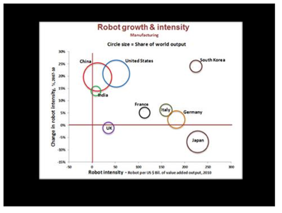
The next and final chart on robot employment provides some insight. In recent years, robots have become cheaper and labor has become more costly. Yes, wages are flat, but healthcare and other fringe-benefit costs are rising. The chart shows which of several countries are experiencing robot growth. The horizontal axis measures robots per billion of value added in manufacturing. The vertical axis shows change in intensity. As indicated, the United States is a high-growth robot country, but not as fast-paced as South Korea.
Measure Twice, Cut Once
There on the executive’s office wall was a framed motto: “Measure Twice. Cut Once.” He was CEO of a stainless steel fabricating company. Material costs are high. Errors are expensive in that business. As I looked at the motto, I couldn’t help but think of the many times I had redone a piece of carpentry work for lack of measuring twice. It occurred to me that my motto must be “measure once, cut twice,” or even worse, “don’t measure at all, and keep on cutting.”
So it is with deficits, budgets, sequestration and collective decision making. Some refer to the congressionally imposed sequestration as mindless budget cutting. There was no measuring, just cutting. But now—as when I do carpentry—adjustments are being made. Air flight controllers? Oh yes, we will adjust for that. (Irate business travelers matter a lot.) White House visits for middle school students? No, show them the door. (Middle school students apparently don’t matter much.) Auctions for offshore drilling in California waters? No, we can’t afford that. (Environmentalists matter a lot.) Politics enters at every margin, of course, but adjustments will take place as the people’s representatives nip and tuck to provide politically acceptable outcomes.
But let’s face it. This is how a democracy does business. We cut and then measure. Even so, for the first time since 2007, the Treasury is actually reducing the size of the federal debt. But before shouting a resounding hooray, we best look closer. Part of Treasury’s revenue surge was driven by unlikely-to-occur-again end-of-year capital-gains transactions taken to avoid higher 2013 taxes. Still, let’s not look a gift horse in the mouth.
The good news about possibilities for reducing the federal debt is supported by evidence that, as shown in the next chart, federal revenues have fully recovered to prerecession levels.
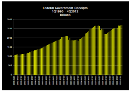
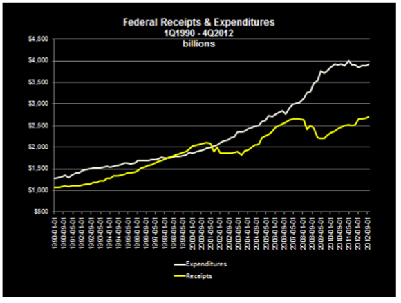
Now the bad news. Consider the next chart. It shows in nominal terms the level of federal receipts and expenditures for 1Q1990 through 4Q2012. Even with progress being made, there is a yawning gap waiting to be closed.
The Continuing Tax Rate Debate
If the gap is to be closed, there is no doubt but that it will take more revenue and less spending. But when it comes to getting revenue, there is a never ending political debate regarding tax-rate fairness and which taxpayer income group, if any, should pay the higher or lower tax rate. (After all, there could be a flat tax.) There is hardly any discussion of revenues, which seems odd, to say the least.
But of course, there is reason to be concerned about fairness. People understandably rebel when they perceive they are being treated unfairly by government. (Consider the current IRS controversy.) But if revenues are the chief concern, then how much revenue is collected may be an equally important consideration when politicians talk about taxes.
Writing in 1924, treasury secretary Andrew W. Mellon said this about the political manipulation of rates:
I have never viewed taxation as a means of rewarding one class of taxpayers or punishing another. If such a point of view ever controls our public policy, the traditions of freedom, justice and equality of opportunity, which are the distinguishing characteristics of our American civilization, will have disappeared and in their place we shall have class legislation with all its attendant evils. The man who seeks to perpetuate prejudice and class hatred is doing America an ill service.
But why pay attention to the thoughts expressed by Andrew Mellon? Does he have credentials that command attention? Yes, indeed. As Secretary of Treasury during the Harding, Coolidge, and Hoover administrations, Mellon led a successful effort to reduce the size and debt of the federal government. In the earlier part of his government service, the nation was adjusting to a post–World War I environment, with lots of debt overhang. Sound familiar? His arguments about the relative merits of lower tax rates to produce higher revenues won the day. And he saw higher revenues when rates were reduced. He literally discovered the basis of what we now celebrate as the Laffer Curve. In all fairness, we should call it the Mellon-Laffer Curve.
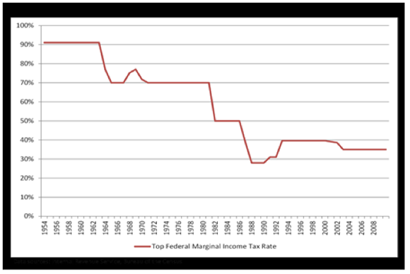
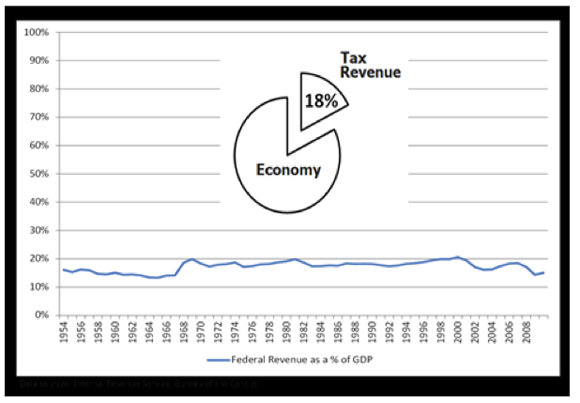
For those who may think that higher tax rates bring in more revenue, consider some data provided by Mercatus economist Antony Davies. The next chart reports the highest marginal income tax rate from 1954 through 2010. The chart that follows shows tax revenues as a share of GDP for the same years. There’s only so much wool the sheep will give.
Looking for Prosperity
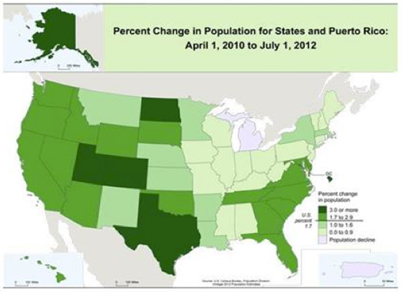
People worldwide are looking for prosperity, and always have been. Population movement is our best evidence of greener pasture assessments made when people vote with their feet. For the United States, we know that some states are growing slowly, some rapidly, and only one, Michigan, is currently losing population.
All else equal, population growth is a good predictor of state real GDP and personal income growth. People, the ultimate resource, often bring income with them in the form of retirement and other transfer payments; they also bring investment income, and of course, those entering the labor force become producers of new income. It is difficult for a state to show income growth in the absence of population growth. Doing so requires increases in productivity for the existing workforce.
The next two charts speak to the relationship between population and income growth for the United States. The first in the series shows population growth for the most recent period. The faster growing states are green, which comes in three shades. States with the two darker hues are growing faster than the national growth rate of 1.7 percent. As can be seen, all of the highest growth states are located west of the Mississippi. The Southeast, with the exception of Alabama and Mississippi, is also growing faster than the national average.
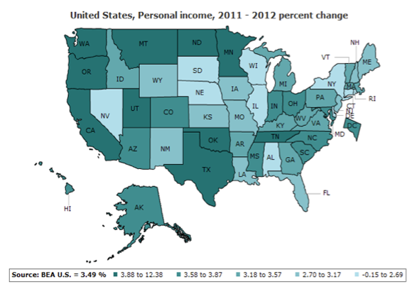
Total personal income growth for 2011–2012 is reported next. The darker the hue, the higher the growth. While mapping from population to income growth is not perfect, the linkages between the two can still be seen.
The IRS and Political Influence
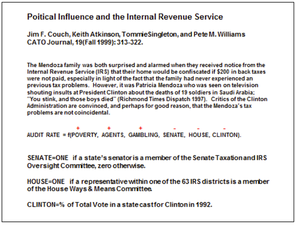
Recent revelations about the IRS targeting Tea Party-affiliated organizations for investigation and slow treatment reminds me of what Public Choice scholars learned long ago. All of government is political. Special-interest influence seeps through in unusual but systematic ways. On the IRS specifically, Jim Couch and colleagues at the University of North Alabama published research in 1999 that focused on statistical treatment of IRS audit activities as conditioned by political variables. The 1995 audit data were part of annual summaries for IRS districts reported in the Transactional Records Access Clearinghouse (TRAC) at Syracuse University.
The Couch et al. statistical model explained the frequency of those audits across states. Their explanatory variable included whether or not a state’s senator sat on the IRS senate oversight committee or a representative sat on the house oversight group, the share of votes cast for President Clinton in 1992, and other variables that are thought to be positively associated with audit activity, such as higher levels of earned income tax credits as proxied by the state poverty rate and gambling income.
A direct quote from and summary of the work and findings are shown below. As indicated by the plus and minus signs over variables, audit rates fall when senators or congressmen sit on IRS oversight committees. They fall when a larger share of a state population voted for Bill Clinton and rise for those states with a poor Clinton record. More agents in a state and more gambling mean more audits, as does a higher share of poverty.
In short, politics seems to matter in explaining IRS audit behavior.
These statistical results parallel others that focused on federal antitrust activity and presidential declarations of national disasters, an action that triggers a flood of federal support. The antitrust study shows that actions are taken less frequently against firms headquartered in the states and districts of congressmen who sit on antitrust agency oversight committees. The national disaster study examined FEMA activity, adjusted for severity of disasters, state population, and other variables. The researchers found greater frequency of disaster declarations for politically important states than for others. The authors reported that some 45 percent of FEMA actions were motivated by politics instead of disaster severity.
These Public Choice findings suggest two things. First, human beings respond to incentives, whether they are supplying houses, food, or politically determined actions. Second, since this is common knowledge, we must take action to reduce occurrences that corrupt the political process. How? By requiring transparency, regular agency reports that demonstrate choice neutrality, publicity, competition from the loyal opposition, and constant vigilance.
Related Content
- | Government Spending Government Spending
- | Policy Briefs Policy Briefs
The Economic Situation, March 2013
- | Government Spending Government Spending
- | Policy Briefs Policy Briefs
The Economic Situation, December 2012
- | Regulation Regulation
- | Policy Briefs Policy Briefs
The Economic Situation, June 2012
