- | Government Spending Government Spending
- | Data Visualizations Data Visualizations
- |
Updated: Comparison of BLS Alternative National Unemployment Rates
This week’s chart is an updated comparison of the different measurements of the unemployment rate from the Bureau of Labor Statistics (BLS). It includes new data on the official and alternative unemployment measurements for 2012 and 2013. The BLS data are used to assess labor market conditions from several perspectives.
This week’s chart is an updated comparison of the different measurements of the unemployment rate from the Bureau of Labor Statistics (BLS). It includes new data on the official and alternative unemployment measurements for 2012 and 2013. The BLS data are used to assess labor market conditions from several perspectives.
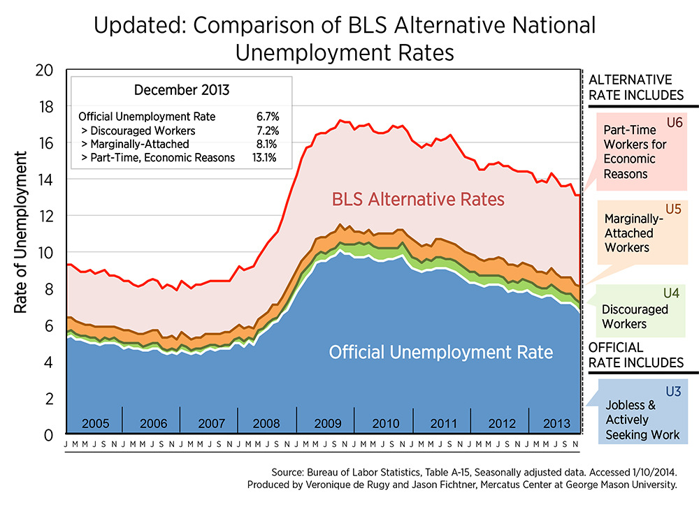
The most commonly reported unemployment rate—6.7 percent in December 2013—is defined as the number of people without jobs who are available to work and are actively seeking work in the four weeks preceding the survey as a percentage of the labor force (the sum of employed and unemployed persons in the economy). This official unemployment rate, which remains the primary measure of labor market performance, is not the most realistic representation of the current state of the economy for several reasons.
The limited perspective on the labor market offered by the official unemployment rate is readily apparent when compared to alternative measures of unemployment. The chart displays the official unemployment rate, or U3 unemployment rate, alongside various alternative measures from 2005 to the most recent data in November 2013.
First, the official U3 number, represented as the blue area on the chart above, can be compared to the number of workers that are “officially” unemployed plus those categorized as “discouraged workers,” known as U4 unemployment. This is represented by the green portion of the graph. Discouraged workers are people who are able to work but cease searching for employment because they believe that no job opportunities exist for them. As of December 2013, the U4 unemployment rate was 7.2 percent, decreasing by 0.2 percentage points from November 2013, only a little less than the official U3 unemployment rate. We would expect the U4 unemployment rate to decrease in healthy economic times as more workers have faith that they can find gainful employment. The U4 unemployment rate has not significantly decreased relative to the official U3 rate since the onset of the recent recession, suggesting persistent structural barriers to employment.
Next, we can consider marginally attached workers with the U5 unemployment rate, represented as the orange portion on the graph. The BLS defines this group as persons who want and are available for work but who are not counted as unemployed under the official U3 measurement because they had not actively searched for work in the four weeks preceding the BLS survey. The U5 rate adds marginally attached workers to their measures of officially unemployed and discouraged workers. In December 2013, the U5 unemployment rate was 8.1 percent, falling by 0.1 percentage points from the month before.
Finally, it is important to consider workers who are “underemployed.” The final alternative measurement is called the U6 unemployment rate, which adds part-time workers for economic reasons. Represented as the red portion on the graph above and totaling 13.1 percent in December 2013, it is considerably higher than the official unemployment rate and showed no change from November 2013. This final measure provides the broadest picture of the current labor situation. Nearly twice the official U3 unemployment rate, it has slightly declined since the onset of the recession but is still significantly higher than pre-recession range of 8–9.3 percent from 2005 to 2007.
At first glimpse, the 6.7 percent official US unemployment rate appears to be good news. Indeed, the early data show that the economy did add 74,000 jobs in December. Also, the 6.7 percent unemployment rate is very close to the 6.5 percent target rate at which the Federal Reserve is expected to cease their monetary stimulus program.
The picture is less rosy after considering the alternative measurements. Much of the decrease in the U3 unemployment rate is due to a decrease in the labor force participation rate. If the labor force participation rate in December 2013 were the same as that in December 2012, the official U3 unemployment rate would be 7.9 percent. Adding in the alternative unemployment measures provides even less cause for celebration. This chart shows that many workers who do not fit the narrow criteria of the official unemployment measurement have struggled to find employment for years, to little avail. It is important to not forget these critical labor demographics in assessing the full unemployment picture in the United States.
This chart demonstrates the need for a broader discussion of the structural barriers to employment that have persisted for so long. Unfortunately, Congress is more focused on papering over the problem with extended unemployment benefits than identifying and rectifying its source.

